Loading... # 教程开始 #### 1、头像呼吸光环和鼠标悬停旋转放大 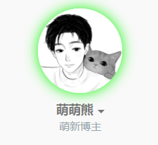 <div class="panel panel-default collapse-panel box-shadow-wrap-lg"><div class="panel-heading panel-collapse" data-toggle="collapse" data-target="#collapse-1bfeabd35dd4fd48b8be35f481a4553134" aria-expanded="true"><div class="accordion-toggle"><span>代码如下 点击展开</span> <i class="pull-right fontello icon-fw fontello-angle-right"></i> </div> </div> <div class="panel-body collapse-panel-body"> <div id="collapse-1bfeabd35dd4fd48b8be35f481a4553134" class="collapse collapse-content"><p></p> ``` .img-full { width: 100px; border-radius: 50%; animation: light 4s ease-in-out infinite; transition: 0.5s; } .img-full:hover { transform: scale(1.15) rotate(720deg); } @keyframes light { 0% { box-shadow: 0 0 4px #f00; } 25% { box-shadow: 0 0 16px #0f0; } 50% { box-shadow: 0 0 4px #00f; } 75% { box-shadow: 0 0 16px #0f0; } 100% { box-shadow: 0 0 4px #f00; } } ``` <p></p></div></div></div> <CODE>如果只需要单色呼吸光环,例如红色,可以将关键帧动画改为:</CODE> ``` @keyframes light { from { box-shadow: 0 0 4px #f00; } to { box-shadow: 0 0 16px #f00; } } ``` #### 2、首页文章列表悬停上浮 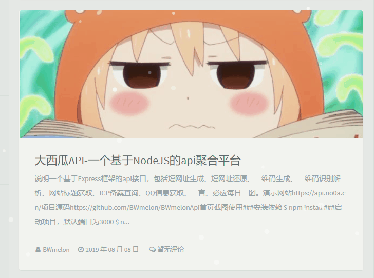 <div class="panel panel-default collapse-panel box-shadow-wrap-lg"><div class="panel-heading panel-collapse" data-toggle="collapse" data-target="#collapse-f7078c56854bbe26d597d13b3e0113de39" aria-expanded="true"><div class="accordion-toggle"><span>代码如下 点击展开</span> <i class="pull-right fontello icon-fw fontello-angle-right"></i> </div> </div> <div class="panel-body collapse-panel-body"> <div id="collapse-f7078c56854bbe26d597d13b3e0113de39" class="collapse collapse-content"><p></p> ``` .blog-post .panel:not(article) { transition: all 0.3s; } .blog-post .panel:not(article):hover { transform: translateY(-10px); box-shadow: 0 8px 10px rgba(73, 90, 47, 0.47); } ``` <p></p></div></div></div> #### 3、首页文章列表头图悬停放大并将超出范围隐藏  <div class="panel panel-default collapse-panel box-shadow-wrap-lg"><div class="panel-heading panel-collapse" data-toggle="collapse" data-target="#collapse-50b04b658f536c48a58ff2f43f5cd9b970" aria-expanded="true"><div class="accordion-toggle"><span>代码如下 点击展开</span> <i class="pull-right fontello icon-fw fontello-angle-right"></i> </div> </div> <div class="panel-body collapse-panel-body"> <div id="collapse-50b04b658f536c48a58ff2f43f5cd9b970" class="collapse collapse-content"><p></p> ``` .index-post-img { overflow: hidden; } .item-thumb { transition: all 0.3s; } .item-thumb:hover { transform: scale(1.1) } ``` <p></p></div></div></div> #### 4、文章内头图和文章图片悬停放大并将超出范围隐藏 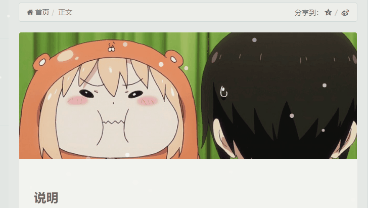 <div class="panel panel-default collapse-panel box-shadow-wrap-lg"><div class="panel-heading panel-collapse" data-toggle="collapse" data-target="#collapse-33167fce630c3844e9ed26682e6e43333" aria-expanded="true"><div class="accordion-toggle"><span>代码如下 点击展开</span> <i class="pull-right fontello icon-fw fontello-angle-right"></i> </div> </div> <div class="panel-body collapse-panel-body"> <div id="collapse-33167fce630c3844e9ed26682e6e43333" class="collapse collapse-content"><p></p> ``` .entry-thumbnail { overflow: hidden; } #post-content img { border-radius: 10px; transition: 0.5s; } #post-content img:hover { transform: scale(1.05); } ``` <p></p></div></div></div> 最后修改:2023 年 06 月 17 日 © 允许规范转载 赞 2 如果觉得我的文章对你有用,请随意赞赏

2 条评论
文章写的不错,继续加油